
How do we design game-apps that feel premium, not just playful?
It starts by rejecting the gimmick. Our design language translates the tactile satisfaction of physical games into responsive, efficient digital interfaces. This playbook codifies the principles, constraints, and visual grammar that make our work survive in the wild—on a mid-range device, with a weak connection, and in the first six seconds of attention.
The Core Loop: Designing for the First 60 Seconds
A game-app dies if the first minute fails. We map interaction to a precise triad: Hook, Invest, Reward. The hook isn't an animation; it's a frictionless entry point—a single, clear action that promises immediate feedback. The invest is micro-commitment: dragging a card, taping a rhythm, swiping to unlock. The reward must be variable. Predictable rewards (Level 2!) feel like chores. Unpredictable rewards (a rare item, a surprise ally) trigger the dopamine loop that keeps a user thinking, "just one more."
The critical design challenge is the "Just One More" Threshold. We design sessions around achievable, micro-goals. A win condition that can be met in 90 seconds, even on a train, ensures the next session feels inevitable, not burdensome. This is where most apps fail: they demand time we don't have. Our loops are bite-sized, with the larger promise (full level, boss fight) always visible but never mandatory for immediate satisfaction.
Avoid the Grind Wall—the point where progress feels like a waiting game. We mitigate this through dynamic difficulty adjustment (subtle, not patronizing) and transparent progression systems. The user should always understand what's next and why it matters. If the path to the next reward is a confusing spreadsheet, we've lost them.
User Scenario: The Commute
Context: A user opens your app on the Paris Metro. They have 2 minutes until their stop.
Success Criteria: The app loads in under 1.5 seconds. One complete, rewarding cycle is completable before the next station announcement. No mandatory tutorial pop-ups.
The Aesthetic of Play
A reference guide for translating gaming grammar into application interfaces. These are not suggestions; they are the foundational rules for our visual language.
Diegetic UI
Interface exists within the game world. A health bar painted on armor, a quest log as a physical map. Blurs the line between UI and world, increasing immersion.
Color as Signal
Strict, limited palette. Red = danger/hostile. Green = safe/progress. Blue = information. Violating this grammar creates cognitive load and frustration.
Motion as Feedback
Every interaction requires a micro-animation: scale, ripple, particle. This isn't decoration; it's a confirmation of intent. Silence is confusing.
Negative Space as Stage
Overcrowded screens kill focus. We use whitespace not as emptiness, but as a stage that directs the eye to the action. The interface should feel calm, not frantic.
The Uplixo Method: A Collage of Constraints
Our philosophy isn't abstract. It's built from observed pitfalls, hard constraints, and the non-negotiable rules that govern our project launches.
"If the user has to think, the design has failed. Clarity is not a feature; it's the foundation."
— Lead Designer, Project 'Aether'
The Three-Tap Rule
No core action—starting a match, accessing inventory, launching a level—should require more than three taps from the home screen. This forces ruthless prioritization of what matters most.
Constraint: Data Sensitivity
In the Turkish market, high data costs are a major barrier. Our apps employ aggressive, transparent asset caching. We never download without user consent, and we always provide a "light" mode for minimal consumption.
Pitfall: Feature Creep in Beta
On 'Project Phoenix', we added 4 mini-games during beta. User engagement on the core loop dropped 30%. The extra content fractured attention. Lesson: Kill features early. The core experience must be rock-solid.
Launch Non-Negotiables
- • 60fps on a 2019 mid-range Snapdragon device.
- • Complete load time < 2 seconds on 4G.
- • Zero mandatory "how-to" tutorials. Use discovery.
- • One-tap pause anywhere. Respect the user's time.
- • Exportable data or no user lock-in.
Scenario: The Weak Connection
A user in a rural area launches the app. Our method dictates: the first screen is cached. The core loop is available. Analytics queue locally. The app doesn't break; it degrades gracefully. Trust is preserved.
From Concept to Launch
Our development rhythm is a narrative, not a checklist. Here’s the journey from a spark of an idea to a published, maintained app.

The Spark
Ideation sessions focused on a single, novel interaction mechanic. We map the "core verb"—the one action the user will perform most. Everything else is noise.
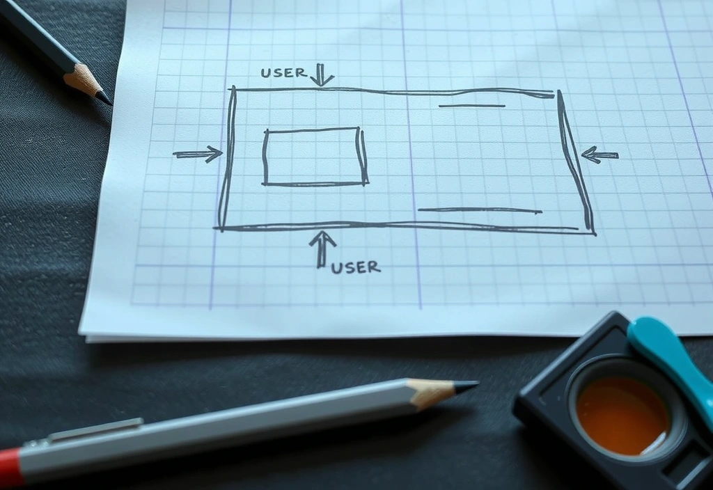
Paper Prototype
Rapid, lo-fi testing of the core loop using physical cards and sticky notes. This step kills bad ideas cheaply and reveals unintuitive flow problems.
Greybox Build
Building the skeleton with placeholder art to test pacing, feel, and performance. The goal is to validate the loop is fun before a single pixel is polished.
Polish Pass
Adding the juice: sound design, particle effects, screen shake, micro-animations. This transforms a functional prototype into a sensory experience.
Launch & Listen
Deploying with analytics and a plan for the first update. The work isn't done at launch; that's when we begin listening to real user behavior and iterating.
Ready to Build Something Real?
This playbook isn't theoretical. It's the distillation of dozens of shipped titles and failed experiments. We apply these principles not because they're trendy, but because they survive contact with real devices, real networks, and real players. If your project demands this level of rigor, we should talk.
Based in Istanbul. Serving global studios. Open Mon-Fri 9:00-18:00.